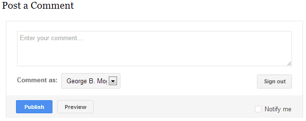
After introducing Google+ comments a couple of months ago, the Blogger team got around to updating the native commenting system with buttons and colors inspired by Google’s new design. I have no idea when the change was actually launched, since I was on vacation abroad for the past week-and-a-half, but judging from some tweets it probably happened during the last 24h. It’s a good sign that Blogger still supports the old comment system and implicitly recognizes that not everyone wants to switch to Google+ comments with their current limitations. Also, the new comment box now spans the entire width of the post, whereas previously it was constrained to something like 500px width. On the other hand the one-size-fits-all design doesn’t quite match Blogger themes and since the comment form is displayed through an iframe it’s nearly impossible to customize. It would be a nice for the comments box to match the overall look of the blog, at least inheriting the color scheme, but I don’t see this happening anytime soon. 
Another problem I noticed in passing is that Blogger started auto-enhancing uploaded images – an unwanted consequence of the merger between the default image storage in Picasa and Google+-Photos. I don’t have the problem quite as often, since I mostly upload screenshots in .png format that doesn’t seem to be affected; but this can be a big problem for photo-bloggers who want their photos to look exactly as they uploaded them, not the way some Google algorithm thinks it’s best. The solution is pretty simple: just disable that option in the Google+ settings.
.@Blogger images are having grey background? Go to https://t.co/BO7nYYLvxB, scroll down to Photos, deselect Automated effects & enhancement.
— Kiril Varbanov (@Kiril_Varbanov) September 25, 2013
Post a Comment